Color plays a crucial role in interior design. It can evoke emotions, create a mood, and even impact our behavior. Understanding the psychology of different hues can help you create a space that not only looks stunning but also enhances the overall ambiance. Let’s delve into color psychology and how you can use it to transform your living spaces.
The Power of Warm Colors
Warm colors like red, orange, and yellow are known for their ability to energize and stimulate. They can create a sense of warmth and comfort in a room, making it feel inviting and cozy. When used in moderation, warm colors can add excitement and vitality to a space.
Key Takeaways –
- Red – Associated with passion and energy, red can stimulate conversation and increase appetite. It’s an excellent choice for dining areas or living rooms where you want to create a vibrant atmosphere.
- Orange—Orange is a friendly and welcoming color that promotes social interaction. It’s perfect for gathering spaces like kitchens and family rooms.
- Yellow – Yellow is known to promote happiness and optimism. It can liven up a space and create a sunny, cheerful atmosphere. Yellow works well in kitchens, bathrooms, and other areas where you want to uplift spirits.
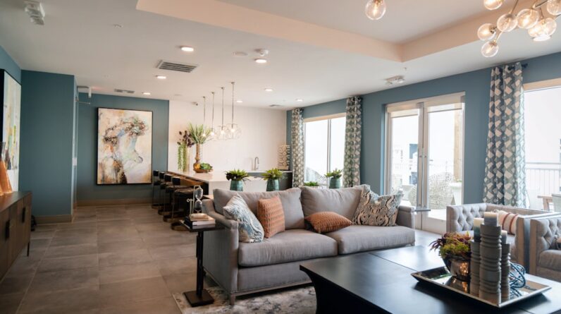
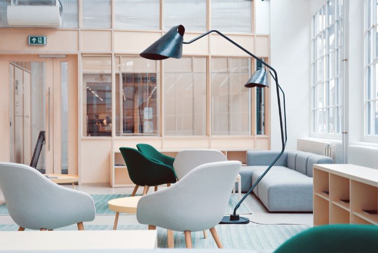
The Tranquility of Cool Colors
Cool colors like blue, green, and purple have a calming effect on the mind and body. They can create a sense of serenity and tranquility, making them ideal for bedrooms, bathrooms, and other spaces where relaxation is essential.
Key Takeaways –
- Blue – Blue is associated with peace and calmness. It can lower blood pressure and promote relaxation, making it an excellent choice for bedrooms and meditation areas.
- Green—Green is the color of nature and can evoke feelings of harmony and balance. It’s a versatile color that works well in any house room and promotes a sense of wellness and renewal.
- Purple – Purple is often associated with luxury and sophistication. It can create a sense of mystery and intrigue in a space, making it an excellent choice for elegant living rooms or home offices.
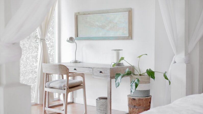
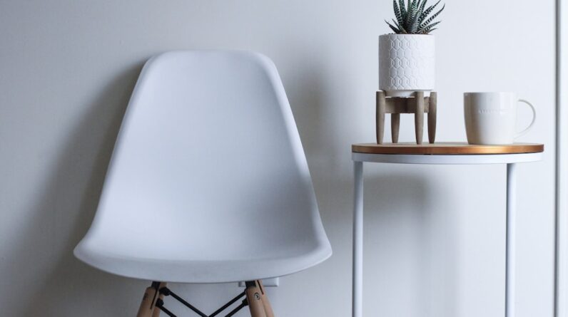
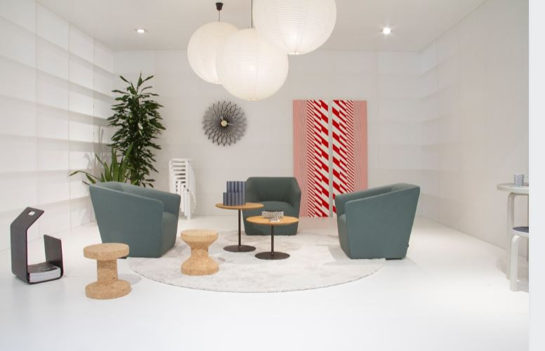
The Versatility of Neutral Colors
Neutral colors like white, gray, and beige are often used as a backdrop in interior design. They can create a sense of balance and harmony, allowing other colors to pop and shine. Neutral colors are timeless and versatile, making them famous for modern interiors.
Key Takeaways –
- White – White is clean, fresh, and bright. It can make a space feel larger and more open, creating airiness and lightness. White works well in any house room, adding a touch of elegance and simplicity.
- Gray – Gray is a sophisticated and elegant color that can add depth and richness to a room. It’s an excellent choice for creating a modern and minimalist look, working well with warm and cool colors.
- Beige – Beige is a warm and versatile neutral that can create a cozy and welcoming atmosphere. It’s an excellent choice for creating a timeless and classic look that will never go out of style.
When designing your space, please look at the mood and ambiance you want to create. Experiment with different color combinations to see how they affect the room’s overall feel. Remember that color is a powerful tool that can transform a space and evoke emotions. By understanding the psychology of hues in interior design, you can create a beautiful space that feels harmonious and inviting.
Content 10/10/G