When you think about color, you might not realize just how deeply it can affect your emotions and behaviors. Each hue carries its own psychological weight, influencing how you feel in a space. For instance, warm colors like red and orange can evoke feelings of warmth and excitement, while cooler shades such as blue and green often promote calmness and tranquility.
This understanding of color psychology is essential when you are designing your home or any space where you spend a significant amount of time. By being aware of how different colors can impact your mood, you can create an environment that aligns with your desired emotional state. Moreover, the cultural context of colors can also play a significant role in their psychological effects.
For example, while white is often associated with purity and peace in Western cultures, it can symbolize mourning in some Eastern cultures. This duality highlights the importance of considering not just personal preferences but also cultural implications when selecting colors for your home. By understanding these nuances, you can make more informed choices that resonate with both you and your guests, creating a space that feels welcoming and harmonious.
Key Takeaways
- Understanding the psychology of color can help you create the desired mood and atmosphere in your home.
- When choosing colors, aim for harmony by selecting hues that complement each other and create a cohesive look.
- Natural and artificial lighting can significantly impact the way colors are perceived in a space, so consider this when making color choices.
- Stay updated on color trends to incorporate modern palettes into your home design and keep your space looking fresh and current.
- When choosing colors for each room, consider the function of the space and the mood you want to create to ensure the right color choice.
Creating Harmony: How to Choose Colors that Complement Each Other
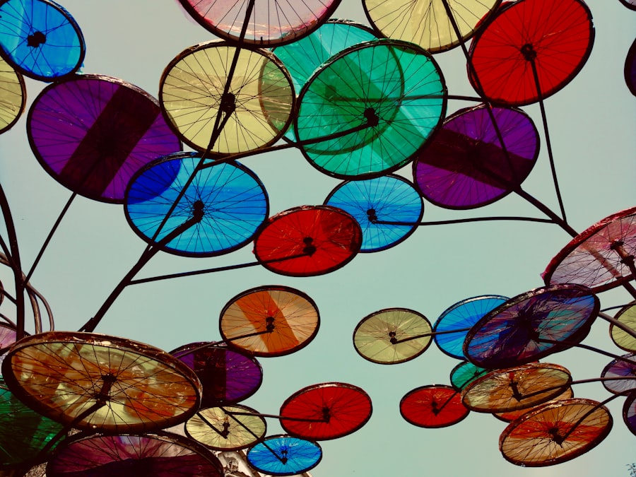
Complementary Colors: Creating Vibrant Contrast
Colors that are opposite each other on the wheel, known as complementary colors, can create a vibrant contrast that energizes a space. For example, pairing blue with orange can create a dynamic look that draws the eye and adds interest. However, it’s essential to balance these bold choices with neutral tones to avoid overwhelming the senses.
Analogous Colors: Fostering Relaxation and Comfort
In addition to complementary colors, you might also explore analogous color schemes, which involve selecting colors that are next to each other on the color wheel. This approach creates a more subtle and cohesive look, perfect for spaces where you want to foster relaxation and comfort. For instance, using shades of green, blue, and teal can evoke a serene atmosphere reminiscent of nature.
Creating a Harmonious Environment
By carefully considering how colors interact with one another, you can create a harmonious environment that feels both intentional and inviting.
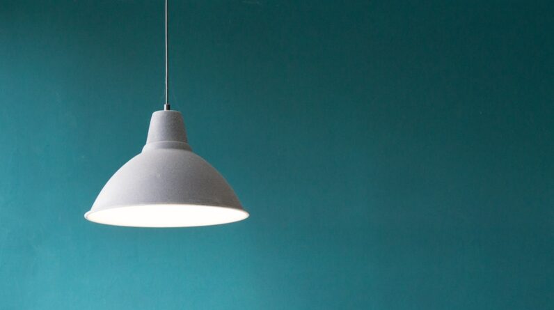
The Role of Lighting: How Natural and Artificial Light Affects Color Perception
Lighting plays a crucial role in how you perceive color within your home. Natural light can dramatically alter the appearance of hues throughout the day, making them appear warmer or cooler depending on the time and intensity of sunlight. For instance, a soft morning light may enhance the warmth of a yellow wall, while harsh midday sun could wash it out.
When selecting colors for your space, it’s vital to consider how different lighting conditions will affect their appearance at various times of day. Artificial lighting also has its own set of challenges and opportunities. The type of bulbs you choose—whether incandescent, fluorescent, or LED—can influence how colors are perceived in your home.
Incandescent bulbs tend to emit a warm glow that enhances warm colors, while fluorescent lights can create a cooler ambiance that may alter the way certain shades appear. To achieve the best results, experiment with different lighting options in your space before making final decisions on color. By understanding the interplay between light and color, you can create an environment that feels cohesive and well thought out.
Color Trends: Incorporating Modern Palettes into Your Home Design
Staying updated on color trends can be an exciting way to refresh your home’s aesthetic without undergoing a complete renovation. Each year brings new palettes that reflect current design sensibilities and cultural shifts. For instance, earthy tones like terracotta and olive green have gained popularity as people seek to connect with nature and create calming environments.
Incorporating these modern hues into your home can breathe new life into your space while keeping it stylish and relevant. However, it’s essential to balance trendy colors with timeless elements to ensure longevity in your design choices. You might consider using trendy colors as accents rather than the primary palette for larger areas.
For example, if you love the idea of incorporating a rich navy blue into your living room, consider using it for an accent wall or decorative pillows instead of painting all four walls. This approach allows you to embrace current trends while maintaining a classic foundation that won’t feel dated in a few years.
Choosing the Right Color for Each Room: Considering Function and Mood
When selecting colors for different rooms in your home, it’s crucial to consider the function of each space and the mood you want to evoke. For example, bedrooms typically benefit from calming colors like soft blues or muted greens that promote relaxation and restful sleep. In contrast, kitchens often thrive on energizing hues like bright yellows or crisp whites that inspire creativity and activity during meal preparation.
Additionally, think about how the layout and natural light in each room will interact with your chosen colors. A small room may feel more spacious with lighter shades, while larger areas can handle darker tones without feeling cramped. By aligning your color choices with the intended use of each room, you can create spaces that not only look beautiful but also serve their purpose effectively.
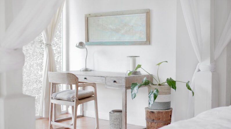
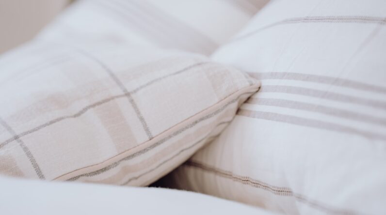
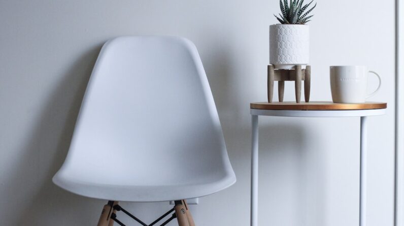
The Power of Neutrals: Using White, Beige, and Gray to Create a Timeless Look
Neutrals have long been celebrated for their versatility and timeless appeal in home design. Shades like white, beige, and gray provide a blank canvas that allows other elements in the room to shine without overwhelming the senses. These colors can create an elegant backdrop for furniture and decor while also making spaces feel more open and airy.
When you choose neutrals as your primary palette, you have the freedom to experiment with textures and patterns without clashing. Moreover, neutrals can be layered to add depth and interest to your design. For instance, combining various shades of gray—from light dove gray to deep charcoal—can create a sophisticated monochromatic look that feels both modern and inviting.
You might also incorporate natural materials like wood or stone to add warmth to an otherwise cool palette. By embracing the power of neutrals, you can achieve a timeless aesthetic that remains stylish regardless of changing trends.
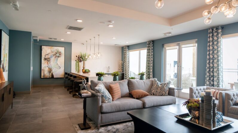
Accent Colors: Adding Pops of Vibrant Hues to Enhance Your Home’s Aesthetic
While neutrals provide a solid foundation for your home’s design, accent colors are where you can truly express your personality and creativity. These vibrant hues can be introduced through accessories such as throw pillows, artwork, or decorative vases. By strategically placing pops of color throughout your space, you can create focal points that draw attention and add visual interest without overwhelming the overall design.
When selecting accent colors, consider using shades that complement your primary palette while also reflecting your personal style. If your main color scheme consists of soft grays and whites, introducing bold accents like emerald green or deep coral can create a striking contrast that enlivens the space. Additionally, don’t be afraid to mix different accent colors; just ensure they share a common undertone or theme to maintain cohesion throughout your design.
Color Schemes for Different Design Styles: From Minimalist to Bohemian, Finding the Perfect Palette
Your design style plays a significant role in determining the best color scheme for your home. For instance, if you lean towards minimalism, you might prefer a palette dominated by whites and soft grays with occasional black accents for contrast. This approach creates a clean and uncluttered look that emphasizes simplicity and functionality.
On the other hand, if you gravitate towards bohemian aesthetics, consider incorporating rich jewel tones like deep purples or vibrant oranges alongside earthy neutrals. This eclectic style thrives on layering textures and patterns, allowing for more freedom in color choices. By understanding how different design styles influence color palettes, you can curate a cohesive look that reflects your unique taste while ensuring harmony throughout your home.
In conclusion, color is an essential element in home design that goes beyond mere aesthetics; it influences mood, perception, and overall ambiance. By understanding the psychology of color, creating harmonious combinations, considering lighting effects, staying updated on trends, choosing appropriate hues for each room based on function and mood, leveraging neutrals effectively, adding vibrant accents thoughtfully, and aligning color schemes with design styles, you can craft spaces that are not only visually appealing but also deeply resonant with who you are. Embrace the power of color in your home design journey; it’s an opportunity to express yourself while creating environments that nurture well-being and joy.
FAQs
What is the science of color?
The science of color, also known as color theory, is the study of how colors interact with each other and how they can be combined to create pleasing visual effects.
How does color affect our emotions and mood?
Color can have a significant impact on our emotions and mood. For example, warm colors like red and yellow can evoke feelings of energy and warmth, while cool colors like blue and green can create a sense of calm and relaxation.
What factors should be considered when choosing a color palette for a home?
When choosing a color palette for a home, factors such as the size of the space, the amount of natural light, and the desired atmosphere should be taken into consideration. It’s also important to consider the existing furniture and decor in the space.
What are some popular color palettes for home interiors?
Popular color palettes for home interiors include neutral tones such as whites, grays, and beiges, as well as bold and vibrant colors like jewel tones and earthy hues. Pastel colors are also a popular choice for creating a soft and serene atmosphere.
How can color be used to create visual interest in a home?
Color can be used to create visual interest in a home by incorporating contrasting colors, using different shades of the same color, or adding pops of color through accessories and accent pieces. Additionally, using a mix of textures and patterns can enhance the visual impact of a color palette.