In the realm of contemporary design, color palettes serve as the backbone of visual aesthetics. They are not merely a collection of hues; they are a language that communicates emotions, sets moods, and defines spaces. As you navigate through the world of design, understanding the significance of color palettes becomes essential.
Each choice you make regarding color can influence the perception of a space, evoke feelings, and even alter the dynamics of a room. Whether you are an interior designer, a graphic artist, or simply someone looking to refresh your living space, grasping the nuances of color palettes can elevate your work and enhance your environment. Color palettes in contemporary design reflect current trends while also paying homage to timeless principles.
They can range from subtle and understated to bold and eye-catching, allowing for a wide spectrum of expression. As you explore various palettes, you will discover how they can transform ordinary spaces into extraordinary experiences. The interplay of colors can create harmony or tension, warmth or coolness, and can even guide the flow of energy within a room.
By delving into the different types of color palettes available today, you will gain insights into how to effectively utilize color to achieve your desired aesthetic.
Key Takeaways
- Color palettes play a crucial role in contemporary design, setting the tone and mood for a space.
- Neutral color palettes are a timeless trend, creating a sense of calm and sophistication in any room.
- Bold and vibrant color palettes make a statement, adding energy and personality to a space.
- Pastel color palettes offer a soft and serene atmosphere, perfect for creating a relaxing environment.
- Monochromatic color palettes embrace simplicity, using variations of a single color to create a cohesive look.
Neutral Color Palettes: The Timeless Trend
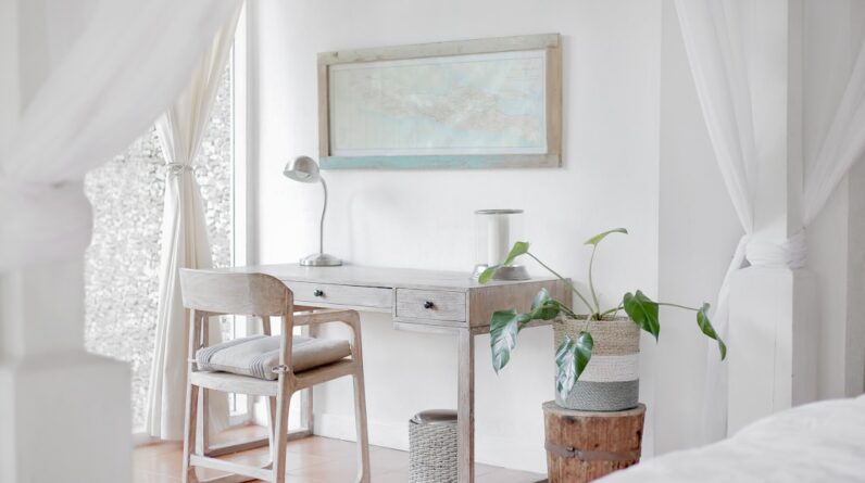
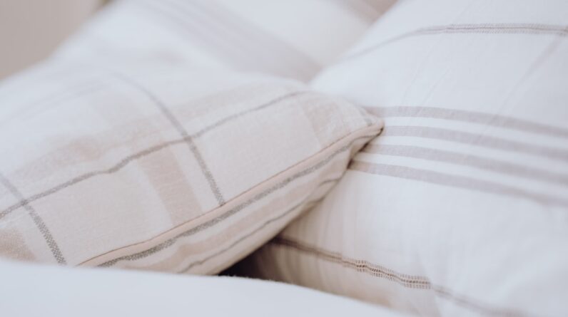
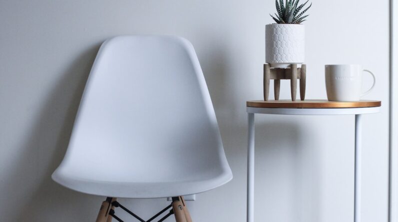
Neutral color palettes have long been celebrated for their versatility and timeless appeal. When you opt for a neutral palette, you are choosing a foundation that allows other elements in your design to shine. Shades like beige, gray, taupe, and white create a serene backdrop that can adapt to various styles and preferences.
This flexibility makes neutral palettes particularly popular in contemporary design, as they can seamlessly blend with both modern and traditional elements. You might find that using neutrals allows you to experiment with textures and materials without overwhelming the senses. Moreover, neutral color palettes evoke a sense of calm and sophistication.
When you incorporate these shades into your design, you create an inviting atmosphere that encourages relaxation and comfort. Imagine stepping into a room adorned with soft beige walls, complemented by warm wooden accents and plush furnishings. The subtlety of the neutral tones fosters a peaceful environment where you can unwind after a long day.
Additionally, neutrals serve as an excellent canvas for introducing pops of color through accessories or artwork, allowing you to maintain a balanced yet dynamic aesthetic.
Bold and Vibrant Color Palettes: Making a Statement

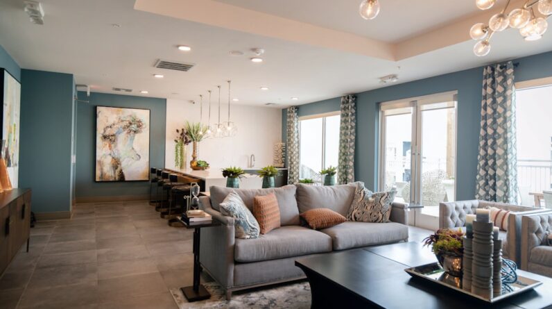
If you are looking to make a statement with your design choices, bold and vibrant color palettes are the way to go. These palettes are characterized by their striking hues—think deep blues, fiery reds, and bright yellows—that demand attention and create an energetic atmosphere. When you embrace bold colors, you invite a sense of excitement and creativity into your space.
This approach is particularly effective in areas where you want to inspire activity or conversation, such as living rooms or creative workspaces. Incorporating vibrant colors into your design can be both exhilarating and challenging. You may find that balancing these intense shades requires careful consideration to avoid overwhelming the space.
One effective strategy is to use bold colors as accents against a more subdued backdrop. For instance, pairing a bright orange sofa with neutral walls allows the sofa to become a focal point without dominating the entire room. Additionally, consider using patterns or textures that incorporate these vibrant hues to add depth and interest while maintaining harmony within the overall design.
Pastel Color Palettes: Soft and Serene
Pastel color palettes offer a refreshing alternative to more saturated hues, providing a soft and serene ambiance that is perfect for creating tranquil spaces. These gentle shades—such as soft pinks, light blues, and pale yellows—evoke feelings of calmness and nostalgia. When you choose pastels for your design, you are inviting a sense of lightness and airiness that can transform any room into a peaceful retreat.
This makes pastel palettes particularly popular in bedrooms and nurseries, where relaxation is key. The beauty of pastel colors lies in their ability to blend harmoniously with one another. You might find that combining various pastel shades creates an ethereal quality that enhances the overall aesthetic of your space.
For example, pairing mint green with lavender can produce a soothing effect that feels both fresh and inviting. Additionally, pastels can be easily accented with natural materials like wood or rattan, further enhancing their soft appeal. As you explore pastel palettes, consider how they can be used to create layers of texture and depth while maintaining an overall sense of tranquility.
Monochromatic Color Palettes: Embracing Simplicity
Monochromatic color palettes focus on variations of a single hue, creating a cohesive and sophisticated look that embraces simplicity. When you choose this approach, you are working within a defined color family—using different shades, tints, and tones of that color to create depth and interest. This technique allows for a streamlined aesthetic that feels intentional and polished.
You may find that monochromatic designs are particularly effective in modern spaces where minimalism is key. One of the advantages of using a monochromatic palette is its ability to highlight textures and shapes within your design. By varying the intensity of your chosen color, you can create visual interest without introducing competing hues.
For instance, if you select blue as your base color, incorporating navy cushions alongside sky-blue walls can add dimension while maintaining harmony. Additionally, this approach allows for easy integration of accessories and artwork that complement your chosen hue without overwhelming the overall design.
Earthy and Natural Color Palettes: Bringing the Outdoors In
Earthy and natural color palettes draw inspiration from the environment around us, incorporating shades found in nature such as greens, browns, and muted blues. When you embrace this palette in your design, you create a warm and inviting atmosphere that fosters a connection to the outdoors. This approach is particularly appealing in contemporary design as it promotes sustainability and mindfulness—qualities that resonate with many individuals today.
Using earthy tones can evoke feelings of comfort and grounding within your space. Imagine walking into a room adorned with warm terracotta walls paired with lush green plants; the combination creates an organic feel that invites relaxation and rejuvenation. Additionally, earthy palettes work well with natural materials like wood, stone, and textiles, enhancing the overall aesthetic while promoting an eco-friendly approach to design.
As you explore this palette further, consider how incorporating natural elements can enhance your space’s connection to the environment.
Metallic Color Palettes: Adding a Touch of Glamour
Metallic color palettes introduce an element of glamour and sophistication into contemporary design. Shades like gold, silver, bronze, and copper can elevate any space by adding depth and richness through their reflective qualities. When you incorporate metallics into your design scheme, you create visual intrigue that captures light and draws attention to specific areas within the room.
This makes metallic palettes particularly effective in spaces where you want to make a bold impression. You might find that using metallics as accents rather than dominant colors allows for a balanced approach that enhances rather than overwhelms your design. For example, incorporating gold fixtures or silver decorative elements against a neutral backdrop can create an elegant focal point without detracting from other design elements.
Additionally, mixing different metallic finishes can add layers of texture while maintaining cohesion within your overall aesthetic. As you experiment with metallic palettes, consider how they can transform ordinary spaces into luxurious experiences.
Unexpected Color Palettes: Breaking the Rules and Creating Contrast
In contemporary design, embracing unexpected color palettes can lead to innovative and striking results. These palettes often defy traditional color theory by combining contrasting hues in ways that challenge conventional aesthetics. When you venture into this territory, you open yourself up to endless possibilities for creativity and self-expression.
The key is to find balance within the chaos—ensuring that even the most unconventional combinations feel intentional rather than haphazard. You may discover that using unexpected colors allows for unique storytelling within your space. For instance, pairing vibrant teal with warm mustard yellow creates an eye-catching contrast that sparks conversation and intrigue.
This approach encourages experimentation; don’t be afraid to mix patterns or textures alongside bold colors to create visual interest while maintaining harmony within your design scheme. As you explore unexpected palettes further, remember that breaking the rules can lead to extraordinary outcomes—allowing your personality to shine through in every corner of your space. In conclusion, understanding color palettes is essential for anyone looking to enhance their design skills or refresh their living environment.
From timeless neutrals to bold statements and unexpected combinations, each palette offers unique opportunities for expression and creativity. By exploring these various approaches to color in contemporary design, you will be better equipped to create spaces that resonate with your personal style while also captivating those who experience them.
FAQs
What are some popular color palettes in contemporary design?
Some popular color palettes in contemporary design include:
– Neutral palettes: such as whites, grays, and beiges
– Monochromatic palettes: using different shades of a single color
– Bold and vibrant palettes: incorporating bright and contrasting colors
– Pastel palettes: featuring soft and muted tones
How do color palettes in contemporary design differ from traditional design?
Color palettes in contemporary design often feature a more minimalist and restrained approach, with a focus on clean lines and simplicity. Traditional design may incorporate more ornate and intricate color combinations.
What influences the popularity of color palettes in contemporary design?
The popularity of color palettes in contemporary design is influenced by various factors, including cultural trends, technological advancements, and the preferences of designers and consumers. Additionally, the use of color psychology and the impact of color on emotions play a role in determining popular color palettes.
Are there specific industries or sectors that favor certain color palettes in contemporary design?
Yes, certain industries or sectors may favor specific color palettes in contemporary design based on their brand identity, target audience, and market positioning. For example, technology companies may lean towards modern and vibrant color palettes, while luxury brands may opt for sophisticated and elegant color combinations.