Introduction to Color in Interior Design
You might not realize it, but the colors you choose for your space have a significant impact on how you feel inside it. What if I told you that the right shade of blue could make your living room feel more peaceful, while an unexpected pop of yellow could energize your home office? In interior design, color isn’t just about aesthetics; it’s a language that speaks to your emotions, sets the ambiance, and reflects your personality. Understanding the role of color in your space can transform how you experience your home, and today, we’re diving into the fascinating world of color in interior design.

The Psychological Impact of Color
Colors evoke emotions, whether you’re aware of it or not. Each hue can conjure different feelings and moods. For instance, warm colors like red and orange can evoke feelings of warmth, comfort, and energy, while cool colors like blue and green are often calming and serene.
You might find that when you walk into a room painted in soft pastels, a feeling of tranquility washes over you—perfect for a bedroom or a cozy reading nook. On the other hand, a vibrant, bright orange kitchen can invigorate your senses and inspire creativity, making it a fantastic choice for culinary adventures. Understanding these associations can help you choose colors that resonate with the emotions you want to foster in different spaces.
Creating Atmosphere with Color
The atmosphere of a room is heavily influenced by its color palette. Have you ever entered a dimly lit room painted in deep, rich colors and felt instantly wrapped in a cozy embrace? Alternatively, walking into a brightly lit area with light colors can create a sense of spaciousness and openness.
When you’re designing a space, consider what kind of atmosphere you want to create. If you’re aiming for a cozy and intimate environment, warm neutrals or deep jewel tones are your best friends. If you want your place to feel airy and expansive, opt for lighter, cooler shades. This interplay between light and color can dramatically alter how you and your guests perceive your space.
Color as a Tool for Definition
One of the clever ways you can use color in interior design is as a tool for defining areas within a space. Suppose you have an open-concept living area. In that case, you can use color to visually separate the dining space from the living room without physical barriers.
Imagine painting one wall of your dining area a rich terracotta while keeping your living room walls a soft gray. This subtle distinction draws the eye and establishes boundaries while maintaining an open, cohesive feel overall. It’s a beautiful example of how color can help define different functionalities in a shared space.
The Role of Color in Style and Trends
Just as fashion has its seasons and trends, so does interior design. You might notice that certain colors dominate particular eras—think of the bold colors of the 80s, the muted tones of the minimalist movement, or the earth tones that reflect our growing awareness of the environment. You can use these trends to inform your choices, but authenticity to your style should always come first.
If the current trend is all about pastel shades and it resonates with you, go for it! However, if you’re drawn to rich, dark tones reminiscent of a Victorian home, then that’s an aesthetic you should explore. Remember, your space should be a reflection of who you are, and your choices in color should align with your personal taste, not just fleeting trends.

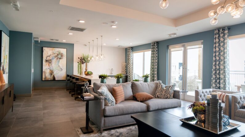
Color Combinations: The Magic of Contrast and Harmony
Finding the right combination of colors in your home can be like discovering a hidden recipe for the perfect dish. When layering colors, you can create either a harmonious palette or a striking contrast that captures attention.
Have you ever seen a room where a muted gray sofa is complemented by vibrant pink and deep green throw pillows? This combination creates a perfect balance of both calm and excitement. The secret lies in understanding the color wheel and how colors interact with one another. Complimentary colors sit opposite each other and can create a dynamic effect, while analogous colors, which sit next to each other, foster harmony. Experimenting with combinations can breathe life into your design scheme.
Accent Colors and Statement Pieces
Accent colors play a vital role in interior design, often used to draw focus to specific features, furniture, or decor items within your space. Perhaps you have a neutral-colored room but decide to throw in a bold red armchair as a statement piece. Your guests’ eyes will naturally gravitate towards it, setting a focal point that can also inspire conversation.
Accent colors can be applied through various elements like artwork, accessories, or even a single wall. This idea allows for flexibility; you can easily swap these pieces when you crave a change, without needing a complete redesign. The bold use of color in small doses can refresh a room and keep the design dynamic.
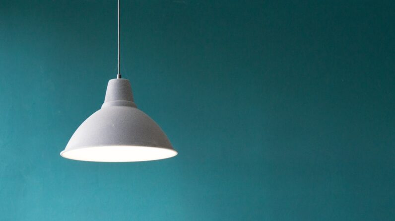
The Importance of Lighting and Color
Lighting is an essential element that can alter how colors appear in your space. Do you realize that the same shade can look drastically different under natural light versus electric light? When you are selecting colors for your home, it’s essential to consider how they will look throughout the day and under different lighting conditions.
Natural light often makes colors appear brighter and more vivid. On the flip side, incandescent bulbs can add warmth, while fluorescent lighting may cast a cool or harsh glare. Testing paint samples in various lighting conditions before making a final decision can help you achieve the desired effect. You may start to appreciate how a color’s identity can change based on light, which ultimately adds to the richness of your design experience.
Cultural Associations with Color
Did you know that colors can have different meanings and associations in various cultures? In some cultures, white signifies purity and new beginnings, while in others, it’s linked to mourning and loss. Similarly, red can symbolize good fortune in certain Asian cultures but may evoke warning or danger in a different context.
As you design your space, being sensitive to these associations can help you communicate your intentions better, especially if your home welcomes guests from various backgrounds. You can create an inclusive environment where everyone feels comfortable and at ease, thanks to your thoughtful color choices.
The Functionality of Color: Practical Considerations
In addition to its aesthetic and emotional impact, color can also serve functional purposes in your interior design. For instance, darker colors may absorb heat, making a sun-drenched room warmer and cozier, while lighter shades can reflect sunlight, keeping a space cool.
If you’re working with a small room, lighter colors can create an illusion of more space, making it feel larger and airier. Likewise, using dark colors in a spacious area can create intimacy and warmth. When considering functionality, remember to balance beauty with practicality to ensure that your space works for you, both visually and functionally.
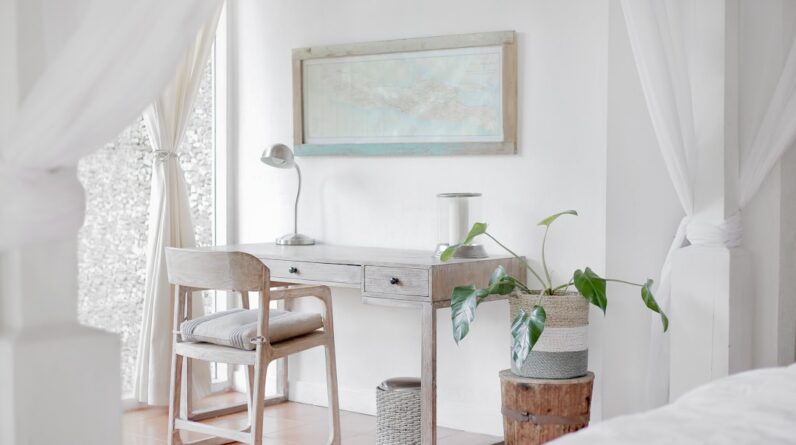
Your Color Palette: The Process of Selection
How do you go about selecting a color palette that represents you? Start by exploring your preferences. You can find inspiration everywhere—from nature, art, or even a favorite outfit. Look through magazines or websites dedicated to interior design. Sometimes, you may find a color combination that resonates deeply with you.
Once you have a few favorites, create a mood board! Gather fabric swatches, paint samples, and images that showcase the colors you love. This board will guide your selection process and help you visualize how these colors work together in your space. Remember, there’s no right or wrong in color selection; it’s all about what makes you feel good.
Conclusion: Embrace the Power of Color
As you embark on your journey to design or refresh your space, take time to consider the profound impact color can have on your environment and your emotions. Allow yourself to experiment, explore different textures, and embrace the power of color to reflect your unique story and personality.
Every stroke of paint, every choice of fabric, and every decoration adds a layer to your experience in that space. Don’t be afraid to embrace bold colors, play with combinations, and define your home in a way that feels completely you. Understanding color in interior design isn’t just a skill—it’s an opportunity to connect with what makes you feel truly at home.
If you enjoyed this article and found it helpful, I’d love to hear your thoughts! Please clap for it, leave a comment, and consider subscribing to my Medium newsletter for more insights and updates. Your engagement means the world to me!