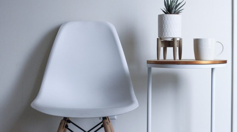
To grasp the essence of design, you must first delve into the principles of symmetry and asymmetry. Symmetry refers to a balanced arrangement where elements mirror each other across a central axis. This concept is deeply rooted in nature and human perception, often evoking feelings of stability and order.
When you encounter a perfectly symmetrical design, it can create a sense of calm and predictability, drawing the viewer in with its harmonious proportions. Think of the human face or the wings of a butterfly; these natural examples illustrate how symmetry can evoke beauty and balance. On the other hand, asymmetry introduces a sense of dynamism and intrigue.
It involves an uneven distribution of visual weight, which can create tension and excitement within a composition. As you explore asymmetry, you may find that it challenges traditional notions of balance, allowing for more creative freedom. This principle can lead to unexpected juxtapositions that capture attention and provoke thought.
By understanding both symmetry and asymmetry, you can begin to appreciate how these principles interact and influence the overall impact of your designs.
Key Takeaways
- Understanding the Principles of Symmetry and Asymmetry
- Symmetry creates balance and harmony in design
- Asymmetry adds dynamic and unexpected visual impact
- Balancing symmetry and asymmetry leads to unique and engaging designs
- Symmetry and asymmetry can be applied in different design elements
Using Symmetry to Create Balance and Harmony in Design
When you incorporate symmetry into your designs, you are essentially crafting a visual language that speaks to balance and harmony. Symmetrical designs can guide the viewer’s eye effortlessly across the composition, creating a sense of flow that is both pleasing and intuitive. For instance, in web design, a symmetrical layout can enhance user experience by providing a clear structure that is easy to navigate.
You might consider using grids or aligning elements along a central axis to achieve this effect, ensuring that your design feels cohesive and well-organized. Moreover, symmetry can evoke emotional responses that resonate with your audience. In branding, for example, companies often utilize symmetrical logos to convey reliability and professionalism.
When you think about iconic brands like Apple or Mercedes-Benz, their logos exemplify how symmetry can reinforce brand identity. By employing symmetrical elements in your designs, you can foster trust and familiarity, making your work more relatable to your audience.
Incorporating Asymmetry for Dynamic and Unexpected Visual Impact
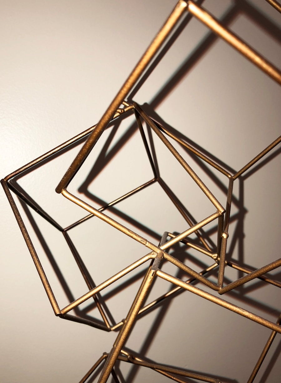
As you venture into the realm of asymmetry, you’ll discover its potential to create dynamic compositions that captivate viewers. Asymmetrical designs often break away from conventional layouts, allowing for more creative expression. This unpredictability can evoke curiosity and encourage viewers to engage with your work on a deeper level.
For instance, when designing a poster or advertisement, consider placing elements off-center or varying their sizes to create visual tension that draws the eye. Incorporating asymmetry also allows you to tell a story through your design. By strategically placing elements in an unbalanced manner, you can guide the viewer’s gaze and create a narrative flow.
Imagine a magazine layout where images and text are arranged in an asymmetrical fashion; this approach can lead the reader through the content in an engaging way. As you experiment with asymmetry, remember that it’s not about chaos but rather about creating a sense of movement and energy that resonates with your audience.
Balancing Symmetry and Asymmetry for a Unique and Engaging Design
Finding the right balance between symmetry and asymmetry is crucial for creating unique and engaging designs. By combining these two principles, you can harness their strengths while mitigating their weaknesses. For instance, you might start with a symmetrical layout as your foundation, then introduce asymmetrical elements to add interest and complexity.
This approach allows you to maintain a sense of order while also injecting creativity into your work. As you explore this balance, consider how different elements interact within your design. A symmetrical background can provide stability, while asymmetrical focal points can draw attention and create visual hierarchy.
This interplay can lead to designs that feel both grounded and dynamic, inviting viewers to explore every detail. By mastering the art of balancing symmetry and asymmetry, you can elevate your designs to new heights, making them not only visually appealing but also thought-provoking.
Applying Symmetry and Asymmetry in Different Design Elements
When applying symmetry and asymmetry in various design elements, it’s essential to consider how each component contributes to the overall composition. In typography, for example, symmetrical arrangements of text can create a sense of order, while asymmetrical placements can add flair and personality. You might experiment with different font sizes or weights to achieve this effect, ensuring that your text complements the visual narrative you wish to convey.
In graphic design, color plays a significant role in establishing symmetry or asymmetry. A symmetrical color palette can evoke harmony, while an asymmetrical use of color can create contrast and excitement. As you choose your colors, think about how they interact with one another and how they contribute to the overall mood of your design.
By thoughtfully applying symmetry and asymmetry across different design elements, you can create cohesive compositions that resonate with your audience.
Utilizing Symmetry and Asymmetry in Graphic Design and Layouts

In graphic design, the application of symmetry and asymmetry is vital for creating effective layouts that communicate your message clearly. Symmetrical layouts often lend themselves well to formal presentations or corporate branding, where clarity and professionalism are paramount. You might consider using grids or aligning elements along a central axis to achieve this effect, ensuring that your design feels organized and easy to navigate.
Conversely, asymmetrical layouts can be particularly effective in more creative fields such as advertising or editorial design. By breaking away from traditional structures, you can create layouts that stand out and capture attention. For instance, an advertisement featuring an asymmetrical arrangement of images and text can evoke curiosity and encourage viewers to engage with the content more deeply.
As you experiment with different layouts, remember that both symmetry and asymmetry have their place in graphic design; it’s all about finding the right balance for your specific project.
Experimenting with Symmetry and Asymmetry in Photography and Art
Photography and art offer unique opportunities to explore symmetry and asymmetry in captivating ways. In photography, you might find that symmetrical compositions create striking images that draw the viewer’s eye directly to the subject matter. Consider capturing reflections in water or architectural structures that exhibit symmetry; these elements can enhance the overall aesthetic appeal of your photographs.
On the flip side, asymmetrical compositions in photography can evoke emotion and tell compelling stories. By positioning subjects off-center or incorporating negative space strategically, you can create images that feel dynamic and engaging. This approach encourages viewers to explore the entire frame rather than focusing solely on the subject.
In art, experimenting with both principles allows for endless creative possibilities; whether through painting or mixed media, embracing symmetry and asymmetry can lead to innovative works that resonate with audiences on multiple levels.
Tips for Incorporating Symmetry and Asymmetry in Your Design Process
As you embark on your design journey, incorporating symmetry and asymmetry effectively requires thoughtful consideration and experimentation. One tip is to start by sketching out various layouts before committing to a final design. This process allows you to visualize how different elements interact with one another while exploring both symmetrical and asymmetrical arrangements.
Another valuable approach is to seek inspiration from nature or existing designs around you. Observe how artists utilize these principles in their work; this observation can spark ideas for your own projects. Additionally, don’t hesitate to iterate on your designs—sometimes the most compelling compositions emerge from trial and error as you refine your approach.
Ultimately, embracing both symmetry and asymmetry will enrich your design process, allowing you to create works that are not only visually appealing but also meaningful. By understanding these principles deeply and applying them thoughtfully across various mediums, you’ll be well-equipped to craft designs that resonate with audiences while showcasing your unique creative voice.
FAQs
What are the principles of symmetry and asymmetry in design?
Symmetry in design refers to creating balance and harmony by arranging elements in a way that they are evenly distributed on either side of a central axis. Asymmetry, on the other hand, involves creating balance and visual interest by arranging elements in an uneven or off-center manner.
How can I incorporate symmetry into my design?
You can incorporate symmetry into your design by using elements such as shapes, patterns, and colors in a way that creates a sense of balance and order. This can be achieved by mirroring elements on either side of a central axis or using radial symmetry to create a circular arrangement of elements.
How can I incorporate asymmetry into my design?
To incorporate asymmetry into your design, you can use elements in an uneven or off-center manner to create visual interest and a sense of dynamic movement. This can be achieved by placing elements of different sizes, shapes, or colors in a way that creates a balanced yet non-symmetrical composition.
What are some examples of incorporating symmetry and asymmetry in design?
Examples of incorporating symmetry in design include using symmetrical patterns in textiles, creating symmetrical layouts in graphic design, and using symmetrical arrangements in interior design. Examples of incorporating asymmetry in design include using asymmetrical compositions in photography, creating asymmetrical balance in fashion design, and using asymmetrical layouts in web design.