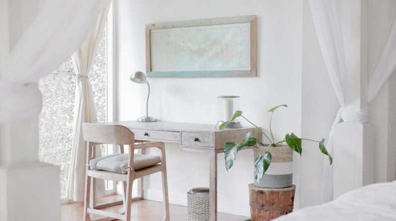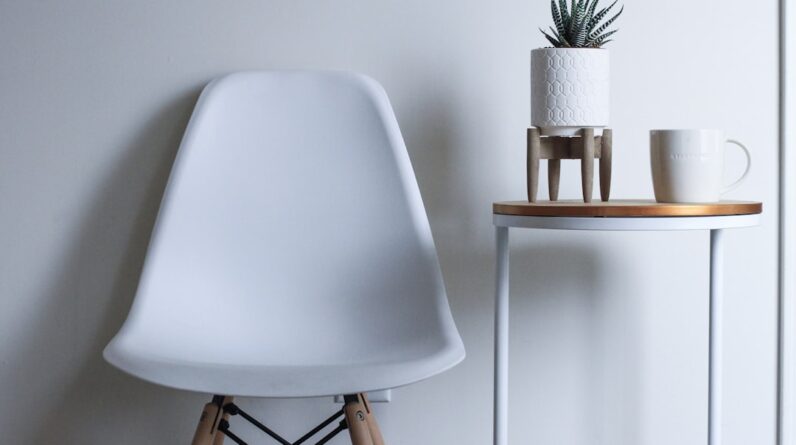
When you step into a room, the first thing that often captures your attention is the color scheme. Color has an undeniable power; it can evoke emotions, set the mood, and even influence how you perceive space. In interior design, the choice of colors is not merely an aesthetic decision but a fundamental aspect that shapes the overall experience of a space.
You might find yourself drawn to certain hues that resonate with your personality or lifestyle, and understanding color schemes can help you create an environment that feels uniquely yours. Color palettes serve as the backbone of any interior design project. They guide your choices in furniture, decor, and even lighting.
Whether you prefer a cohesive look or a more eclectic mix, knowing how to effectively use color can transform your living space into a sanctuary that reflects your tastes and values. As you explore various color schemes, consider how they can enhance not only the visual appeal of your home but also your emotional well-being. The right colors can create a sense of calm, inspire creativity, or even energize a room, making it essential to choose wisely.
Key Takeaways
- Understanding color schemes and palettes is essential in interior design
- Earthy and natural tones are becoming increasingly popular in interior design
- Bold and vibrant hues are being embraced to add energy and personality to spaces
- Soft and serene pastels are being incorporated to create a calming and soothing atmosphere
- Mixing and matching contrasting colors can create visual interest and depth in a space
The Rise of Earthy and Natural Tones
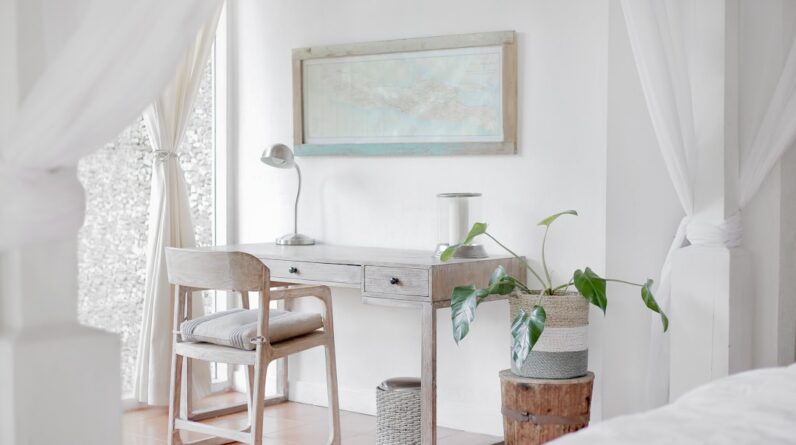
In recent years, there has been a noticeable shift towards earthy and natural tones in interior design. These colors, reminiscent of the great outdoors, bring a sense of warmth and tranquility into your home. Shades like terracotta, olive green, and sandy beige evoke feelings of comfort and connection to nature.
As you incorporate these tones into your space, you may find that they create a grounding effect, making your home feel more inviting and serene. The appeal of earthy colors lies in their versatility. You can use them as a base for your design or as accent colors to complement bolder hues.
Imagine painting your living room walls a soft sage green and pairing it with wooden furniture and natural textiles. This combination not only enhances the aesthetic but also fosters a sense of harmony with the environment. As you experiment with these tones, consider how they can be layered with textures like stone, wood, and plants to create a cohesive look that celebrates the beauty of nature.
Embracing Bold and Vibrant Hues

On the other end of the spectrum, bold and vibrant hues are making waves in contemporary interior design. These colors can inject energy and personality into your space, allowing you to express your individuality. Think of rich jewel tones like emerald green, sapphire blue, or ruby red; these shades can serve as stunning focal points in any room.
When you embrace bold colors, you invite a sense of excitement and dynamism into your home. Incorporating vibrant hues doesn’t mean overwhelming your space with color; rather, it’s about finding the right balance. You might choose to paint an accent wall in a striking color while keeping the rest of the room neutral.
Alternatively, you could introduce bold colors through accessories like cushions, artwork, or rugs. This approach allows you to experiment with vibrant shades without committing to them entirely. As you explore this avenue, consider how these colors can reflect your mood and style, creating an atmosphere that feels both lively and inviting.
Incorporating Soft and Serene Pastels
If bold colors are too intense for your taste, soft and serene pastels offer a gentle alternative that can create a calming atmosphere in your home. Shades like blush pink, baby blue, and mint green evoke feelings of tranquility and peace. These colors are particularly effective in spaces where relaxation is key, such as bedrooms or reading nooks.
By incorporating pastels into your design scheme, you can cultivate an environment that promotes restfulness and serenity. Pastels can be used in various ways to enhance your interior design. You might opt for pastel-colored walls paired with white trim for a fresh and airy feel.
Alternatively, consider using pastel accents in furniture or decor items to add subtle pops of color without overwhelming the space. The beauty of pastels lies in their ability to blend seamlessly with other colors, allowing for versatile combinations that can suit any style. As you explore this palette, think about how these soft hues can create a soothing backdrop for your daily life.
Mixing and Matching Contrasting Colors
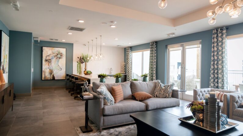
One of the most exciting aspects of interior design is the opportunity to mix and match contrasting colors. This approach allows you to create visual interest and depth within your space. By pairing complementary colors—such as blue and orange or yellow and purple—you can achieve a dynamic look that captures attention and sparks conversation.
As you experiment with contrasting colors, consider how they can work together to enhance the overall aesthetic of your home. When mixing contrasting colors, it’s essential to maintain balance. You might choose one dominant color while using the other as an accent to avoid overwhelming the space.
For instance, a navy blue sofa can be beautifully complemented by vibrant orange cushions or artwork. This technique not only adds visual intrigue but also allows you to express your creativity and personal style. As you play with contrasting colors, think about how they can reflect your personality and create a unique atmosphere that feels distinctly yours.
Experimenting with Monochromatic Schemes

The Power of Unity
By playing with different tones, tints, and shades of one color, you can achieve depth and dimension without introducing multiple hues. For example, using various shades of gray can create a modern and chic environment that feels both stylish and serene.
Adding Texture and Interest
When experimenting with monochromatic schemes, texture becomes crucial in adding interest to the space. You might incorporate different materials—such as soft fabrics, sleek metals, or natural woods—to create contrast within the same color family.
Simplifying Choices, Amplifying Creativity
This approach allows you to maintain a unified look while still achieving visual complexity. As you explore monochromatic designs, consider how this technique can simplify your choices while still allowing for creativity in texture and form.
Infusing Metallic Accents and Finishes
Metallic accents have become increasingly popular in interior design, adding a touch of glamour and sophistication to any space. Whether it’s gold, silver, or copper, metallic finishes can elevate your design by introducing reflective surfaces that catch the light beautifully. You might choose to incorporate metallic elements through light fixtures, furniture hardware, or decorative accessories like mirrors and vases.
These accents not only enhance the aesthetic but also create a sense of luxury within your home. When using metallics in your design scheme, it’s essential to strike the right balance between shine and subtlety. Too much metallic can overwhelm a space; instead, consider using it as an accent against more muted colors or textures.
For instance, pairing brushed gold fixtures with deep navy walls creates an elegant contrast that feels both modern and timeless. As you infuse metallic accents into your design, think about how they can complement your overall color palette while adding an element of sophistication.
Utilizing Sustainable and Eco-Friendly Color Palettes
As awareness of environmental issues grows, many homeowners are turning towards sustainable and eco-friendly color palettes in their interior design choices. These palettes often feature natural pigments derived from plants or minerals, promoting not only aesthetic appeal but also environmental responsibility. By choosing eco-friendly paints and materials, you contribute to a healthier living environment while still achieving beautiful results.
Sustainable color palettes often lean towards earthy tones that reflect nature’s beauty—think soft greens, warm browns, and muted blues. These colors not only evoke feelings of calm but also align with a growing desire for eco-conscious living. When selecting materials for your home, consider options like reclaimed wood or organic textiles that complement these palettes while minimizing environmental impact.
As you embrace sustainable design practices, think about how these choices can enhance both your home’s aesthetic and its connection to the planet. In conclusion, exploring color schemes and palettes in interior design opens up a world of possibilities for creating spaces that reflect your personality and values. Whether you gravitate towards earthy tones or bold hues, each choice contributes to the overall atmosphere of your home.
By understanding how different colors interact and influence mood, you can craft an environment that feels uniquely yours—one that inspires creativity, promotes relaxation, or energizes daily life. As you embark on this journey of color exploration, remember that the most important aspect is creating a space where you feel truly at home.
FAQs
What are color schemes and palettes in interior design?
Color schemes and palettes in interior design refer to the combination of colors used to create a specific aesthetic or mood within a space. They can include a range of colors that work together harmoniously to create a cohesive and visually appealing design.
What are the emerging trends in color schemes and palettes within interior design?
Some emerging trends in color schemes and palettes within interior design include the use of earthy tones, such as terracotta, olive green, and warm neutrals, as well as the incorporation of bold and vibrant colors to add pops of excitement to a space. Additionally, there is a growing interest in using biophilic colors inspired by nature, such as deep blues, forest greens, and rich browns.
How are color schemes and palettes being used to create specific atmospheres within interior design?
Color schemes and palettes are being used to create specific atmospheres within interior design by evoking certain emotions and moods. For example, cool tones like blues and greens can create a calming and serene atmosphere, while warm tones like yellows and oranges can create a more energetic and inviting atmosphere. Additionally, the use of monochromatic color schemes can create a sense of sophistication and elegance, while contrasting color palettes can add drama and visual interest to a space.
What role do color schemes and palettes play in influencing interior design trends?
Color schemes and palettes play a significant role in influencing interior design trends as they have the power to transform a space and set the tone for the overall design aesthetic. They can also reflect broader societal trends and cultural influences, such as the growing interest in sustainability and nature-inspired color palettes. As a result, interior designers often look to color trends to stay current and create designs that resonate with their clients and the wider design community.