Color psychology is a fascinating field that explores how colors influence human emotions, behaviors, and perceptions. In the realm of interior design, understanding color psychology is essential for creating spaces that not only look aesthetically pleasing but also evoke the desired emotional responses from their inhabitants. The colors chosen for a room can significantly affect how individuals feel and interact within that space.
For instance, a vibrant red can stimulate energy and excitement, while a soft blue can promote calmness and tranquility. This interplay between color and emotion is a powerful tool for designers, allowing them to craft environments that resonate with the intended purpose of each room. As society becomes increasingly aware of the psychological effects of color, interior designers are leveraging this knowledge to enhance the functionality and ambiance of spaces.
Whether it’s a cozy living room, a productive office, or a serene bedroom, the right color choices can transform an ordinary space into one that feels tailored to its occupants’ needs. By delving into the principles of color psychology, designers can create environments that not only reflect personal style but also support mental well-being and emotional health.
Key Takeaways
- Color psychology plays a crucial role in interior design, influencing emotions and mood.
- Different colors have the power to evoke specific emotions and create different atmospheres in a space.
- The right color choices for different rooms can enhance the functionality and ambiance of the space.
- Creating a harmonious color palette involves understanding color theory and balancing different hues, tints, and shades.
- Using color to highlight architectural features can draw attention to the unique elements of a space and create visual interest.
Understanding the Impact of Color on Emotions and Mood
Colors have a profound impact on human emotions and can evoke a wide range of feelings. For example, warm colors such as red, orange, and yellow are often associated with energy, warmth, and enthusiasm. These colors can stimulate conversation and activity, making them ideal for social spaces like dining rooms or kitchens.
Conversely, cool colors such as blue, green, and purple tend to have a calming effect, promoting relaxation and tranquility. This makes them suitable for bedrooms or meditation spaces where peace and serenity are desired. Research has shown that color can even influence physiological responses.
For instance, studies indicate that exposure to red can increase heart rates and create a sense of urgency, while blue has been linked to lower blood pressure and feelings of calmness. Understanding these emotional responses allows designers to strategically select colors that align with the intended atmosphere of a space. By considering how different hues affect mood, designers can create environments that foster productivity, relaxation, or social interaction as needed.
Choosing the Right Colors for Different Rooms
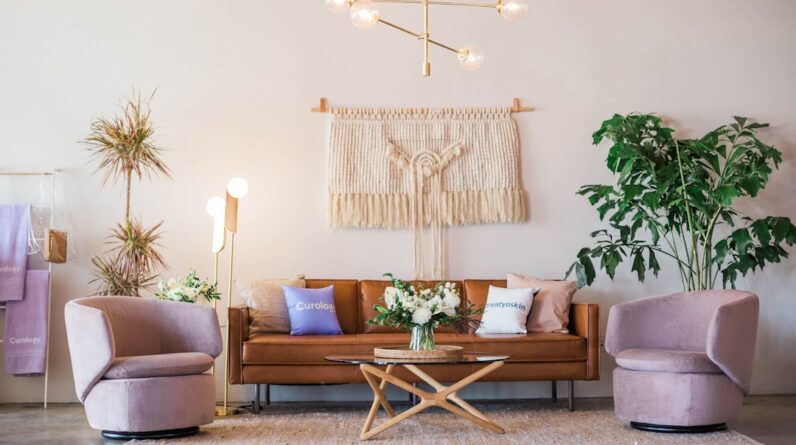
When selecting colors for various rooms in a home or office, it is crucial to consider the function of each space. For example, in a living room where families gather and socialize, warm tones like soft yellows or earthy oranges can create an inviting atmosphere. These colors encourage interaction and warmth, making the space feel more welcoming.
On the other hand, in a home office where focus and concentration are paramount, cooler shades like muted greens or blues can help maintain clarity and reduce distractions. Bedrooms present another unique opportunity for color selection. Soft pastels or neutral tones can create a serene environment conducive to rest and relaxation.
Shades like lavender or light gray can evoke feelings of calmness and comfort, promoting better sleep quality. In contrast, children’s rooms might benefit from brighter colors that inspire creativity and playfulness. Colors like bright pinks or vibrant blues can stimulate imagination while still being balanced with softer accents to avoid overwhelming the senses.
Creating a Harmonious Color Palette
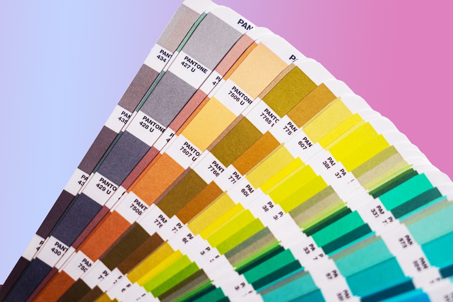
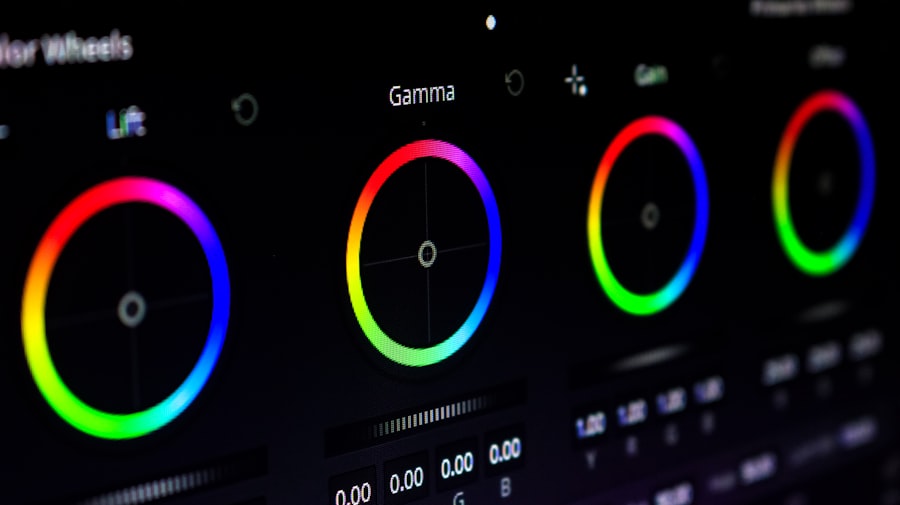
A harmonious color palette is essential for achieving a cohesive look throughout a space. This involves selecting colors that complement each other while also considering the overall mood desired in the environment. One effective method for creating harmony is using the color wheel as a guide.
Complementary colors—those opposite each other on the wheel—can create striking contrasts when used together but should be balanced with neutral tones to avoid visual chaos. Another approach is to use analogous colors, which are adjacent to each other on the color wheel. This technique creates a more subtle transition between hues and can evoke a sense of unity within a space.
For instance, combining shades of blue with green can create a tranquil atmosphere reminiscent of nature. Additionally, incorporating varying shades and tints of a single color can add depth and interest without straying from the overall theme. By thoughtfully curating a color palette that reflects both personal style and emotional intent, designers can create spaces that feel harmonious and inviting.
Using Color to Highlight Architectural Features
Color can also be employed strategically to accentuate architectural features within a space. For instance, painting an accent wall in a bold hue can draw attention to unique architectural elements such as fireplaces, built-in shelves, or intricate moldings. This technique not only highlights these features but also adds visual interest to the room.
A deep navy blue wall behind a white mantelpiece can create a stunning focal point that enhances the overall design. Moreover, color can be used to define different areas within an open-concept space. By employing varying shades or tones in different zones—such as using warm neutrals in the living area and cooler tones in the dining area—designers can create distinct atmospheres while maintaining an overall sense of flow.
This approach allows for functional differentiation without the need for physical barriers, making it particularly effective in modern homes where open layouts are prevalent.
Incorporating Color Psychology into Furniture and Decor
Beyond wall colors, furniture and decor choices also play a significant role in conveying color psychology within interior spaces. Upholstery fabrics in vibrant colors can energize a room while adding texture and comfort. For example, a bright yellow sofa can serve as an eye-catching centerpiece in a living room, infusing the space with warmth and cheerfulness.
Similarly, decorative pillows in various shades can introduce layers of color that enhance the overall palette. Artwork is another powerful tool for incorporating color psychology into interior design. A large canvas featuring bold reds and oranges can evoke passion and excitement when hung in a dining area or kitchen, while serene landscapes in soft blues and greens can promote relaxation when displayed in bedrooms or bathrooms.
By thoughtfully selecting furniture pieces and decor items that align with the desired emotional tone of each room, designers can create cohesive environments that resonate with their occupants on multiple levels.
Tips for Experimenting with Color in Interior Design
Experimenting with color in interior design can be both exciting and daunting. One effective strategy is to start small by introducing color through accessories such as throw pillows, rugs, or artwork before committing to larger changes like painting walls or purchasing new furniture. This allows individuals to test how different colors interact within their space without overwhelming it initially.
Another tip is to utilize samples or swatches when considering paint colors for walls. Applying test patches on walls at different times of day can help visualize how natural light affects the hue throughout the day. Additionally, considering the existing elements within the space—such as flooring or cabinetry—can guide color choices to ensure they harmonize well with what is already present.
For those feeling particularly adventurous, embracing bold colors through statement pieces can make a significant impact. A brightly colored accent chair or an oversized piece of art can serve as focal points that energize an otherwise neutral room. Ultimately, experimenting with color should be an enjoyable process that reflects personal style while enhancing the emotional atmosphere of the space.
Harnessing the Power of Color Psychology in Your Space
Harnessing the power of color psychology in interior design allows individuals to create spaces that are not only visually appealing but also emotionally resonant. By understanding how different colors impact mood and behavior, designers can make informed choices that enhance the functionality and ambiance of each room. From selecting appropriate hues for specific spaces to creating harmonious palettes that reflect personal style, the thoughtful application of color can transform any environment into one that supports well-being and fosters positive experiences.
As individuals continue to explore their unique preferences and emotional responses to color, they will find endless opportunities for creativity within their spaces. Whether through bold statements or subtle accents, incorporating color psychology into interior design offers a pathway to crafting environments that truly feel like home—places where comfort meets inspiration and where every hue contributes to an overall sense of harmony and balance.
FAQs
What is color psychology in interior design?
Color psychology in interior design is the study of how different colors can affect human emotions, moods, and behaviors within a space. It involves understanding the psychological effects of various colors and using this knowledge to create a desired atmosphere or ambiance in a room.
How does color psychology impact interior design?
Color psychology impacts interior design by influencing the way people perceive and experience a space. Different colors can evoke specific emotions and feelings, and understanding these effects allows designers to create environments that promote certain moods or behaviors.
What are some common associations with specific colors in interior design?
– Red: Often associated with energy, passion, and warmth.
– Blue: Known for its calming and soothing effects, often associated with tranquility and serenity.
– Yellow: Evokes feelings of happiness, positivity, and energy.
– Green: Symbolizes nature, growth, and harmony, often associated with balance and renewal.
– Purple: Often linked to luxury, creativity, and spirituality.
– Orange: Represents enthusiasm, creativity, and warmth.
– White: Symbolizes purity, cleanliness, and simplicity.
– Black: Often associated with sophistication, elegance, and mystery.
How can color psychology be applied in interior design?
Color psychology can be applied in interior design by carefully selecting and using colors to achieve specific goals. For example, warm colors like red and orange can be used to create a cozy and inviting atmosphere in a living room, while cool colors like blue and green can promote relaxation and calmness in a bedroom.
What are some tips for using color psychology in interior design?
– Consider the function of the space: Different colors can support different activities, so it’s important to consider the purpose of the room when choosing colors.
– Pay attention to natural light: Natural light can affect the way colors appear in a space, so it’s important to consider how lighting will impact the overall color scheme.
– Use color accents: Introducing pops of color through accessories or accent walls can add visual interest and impact the overall mood of a room.
– Consider personal preferences: While color psychology provides general guidelines, individual preferences and cultural associations with colors should also be taken into account.