Monochromatic color schemes are built around a single hue, utilizing variations in saturation and brightness to create a cohesive and harmonious aesthetic. This approach to color design is not only visually striking but also offers a sense of unity and simplicity that can be incredibly appealing in various contexts, from interior design to graphic arts. The essence of a monochromatic palette lies in its ability to evoke emotions and set the mood without the distraction of competing colors.
By focusing on one color, designers can explore its full range, from the lightest tints to the darkest shades, allowing for a nuanced expression of that hue. The psychological impact of monochromatic schemes is profound. For instance, a room painted in varying shades of blue can evoke feelings of calmness and tranquility, making it an ideal choice for spaces intended for relaxation, such as bedrooms or reading nooks.
Conversely, a monochromatic red scheme can create an atmosphere of energy and passion, suitable for dining areas or creative studios. Understanding the emotional resonance of colors is crucial when embarking on a monochromatic design journey, as it allows for the intentional crafting of spaces that align with desired feelings and experiences.
Key Takeaways
- Monochromatic color schemes use variations of a single color to create a cohesive and harmonious design.
- When choosing the right color for your monochromatic palette, consider the mood and atmosphere you want to create in the space.
- Playing with different shades and tints of the chosen color can add depth and interest to the design.
- Adding contrast through the use of different textures and finishes can enhance the visual appeal of a monochromatic space.
- Incorporating texture and pattern in a monochromatic space can add visual interest and prevent the design from feeling flat.
Choosing the Right Color for Your Monochromatic Palette
Selecting the right color for a monochromatic palette is a pivotal step that can significantly influence the overall ambiance of a space. The choice should be guided by the purpose of the room and the emotions you wish to evoke. For example, soft greens can instill a sense of nature and renewal, making them perfect for bathrooms or kitchens where freshness is desired.
On the other hand, deep purples can add a touch of luxury and sophistication, ideal for formal living rooms or bedrooms. When choosing a color, it’s also essential to consider the existing elements within the space, such as furniture, flooring, and lighting. A color that complements these elements will create a more harmonious environment.
For instance, if you have warm wooden floors, opting for a warm monochromatic palette with shades of beige or terracotta can enhance the natural beauty of the wood while maintaining a cohesive look. Additionally, testing paint samples in different lighting conditions can help you see how the color changes throughout the day, ensuring that your final choice aligns with your vision.
Playing with Different Shades and Tints
Once you have selected your primary color, the next step is to explore its various shades and tints. Shades are created by adding black to a color, resulting in darker variations that can add depth and richness to your design. Tints, conversely, are made by adding white, producing lighter versions that can brighten a space and create an airy feel.
By skillfully combining these shades and tints, you can create a dynamic visual experience that keeps the eye engaged without overwhelming it. For example, in a monochromatic blue scheme, you might use a deep navy for an accent wall while incorporating lighter sky blues in furnishings and decor. This layering of colors not only adds visual interest but also helps to define different areas within an open space.
In contrast, using too many similar shades without variation can lead to a flat appearance. Therefore, it’s crucial to strike a balance between light and dark tones to maintain visual intrigue while adhering to the monochromatic theme.
Adding Depth and Contrast to Your Monochromatic Design
While monochromatic designs are inherently unified, introducing depth and contrast is essential to prevent them from feeling monotonous. One effective way to achieve this is through the strategic use of darker shades against lighter ones. For instance, if your primary color is green, incorporating dark forest green elements alongside soft mint accents can create a striking contrast that adds dimension to the space.
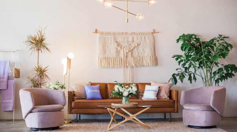
Another method to enhance depth is through layering different textures within the same color family. A plush velvet sofa in a deep burgundy paired with silk cushions in a lighter shade of red can create an inviting atmosphere while maintaining the monochromatic theme. The interplay of textures not only adds visual interest but also invites touch, enriching the sensory experience of the space.
Additionally, consider using lighting strategically; shadows created by light sources can further enhance depth and highlight specific areas or features within your design.
Incorporating Texture and Pattern in a Monochromatic Space
Texture and pattern play crucial roles in elevating monochromatic designs from simple to sophisticated. By incorporating various materials—such as wood, metal, fabric, and ceramics—you can create layers that add richness to your palette. For example, in a monochromatic gray scheme, combining matte finishes with glossy surfaces can create an engaging contrast that draws attention without introducing new colors.
Patterns also serve as an excellent tool for adding visual interest within a monochromatic framework. Stripes, polka dots, or geometric designs in varying shades of your chosen color can break up solid expanses and provide focal points throughout the space. For instance, a patterned area rug in different shades of blue can anchor a room while complementing solid-colored furniture pieces.
When selecting patterns, it’s essential to ensure they align with the overall style of the room; bold patterns may suit contemporary spaces while subtle designs may be more appropriate for traditional settings.
Using Accents and Accessories to Enhance a Monochromatic Room
Accents and accessories are vital components in enhancing a monochromatic room’s overall aesthetic. These elements allow for personal expression while maintaining adherence to the chosen color scheme. Accessories such as cushions, throws, artwork, and decorative objects can introduce subtle variations in tone and texture that enrich the space without overwhelming it.
For example, if your primary color is yellow, consider incorporating accessories in varying shades like mustard or pale lemon. A collection of vases in different finishes—glossy ceramic alongside matte stone—can add depth while remaining within the same color family. Additionally, artwork featuring different shades of yellow can serve as focal points that draw the eye and provide visual breaks within the design.
The key is to select accessories that resonate with your chosen hue while ensuring they contribute positively to the overall composition.
Monochromatic Magic in Different Design Styles
Monochromatic schemes are versatile enough to fit into various design styles, each bringing its unique flair to this approach. In minimalist design, for instance, a monochromatic palette emphasizes simplicity and functionality. A room dominated by white with varying shades of cream can create an ethereal quality that feels spacious and uncluttered.
Conversely, in bohemian design, a rich monochromatic palette—such as deep reds or earthy browns—can evoke warmth and comfort while allowing for eclectic layering of textures and patterns. The key is to adapt the monochromatic approach to suit the specific characteristics of each style while maintaining coherence throughout the space. Whether it’s through sleek lines in modern design or intricate details in traditional settings, monochromatic schemes can be tailored to enhance any aesthetic.
Tips for Creating a Cohesive Monochromatic Look
Creating a cohesive monochromatic look requires careful planning and consideration of various elements within your space. Start by establishing a clear focal point; this could be an accent wall or a statement piece of furniture that embodies your chosen color. From there, build around this focal point by selecting complementary shades and textures that enhance rather than compete with it.
Additionally, consider the flow between different areas within your space. Transitioning from one room to another should feel seamless; using similar tones across adjacent spaces can help achieve this effect. Lighting also plays a crucial role; ensure that natural light sources are maximized while incorporating layered artificial lighting to highlight different aspects of your design throughout the day.
Finally, don’t shy away from experimenting; sometimes unexpected combinations can lead to stunning results that elevate your monochromatic vision into something truly unique.
FAQs
What is a monochromatic color palette?
A monochromatic color palette is a design concept that involves using variations of a single color, along with its tints, tones, and shades. This creates a harmonious and cohesive look in a design or artwork.
How can I create a monochromatic color palette?
To create a monochromatic color palette, start with a base color and then use its lighter and darker shades, as well as its tints and tones. This can be achieved by adjusting the saturation, brightness, and darkness of the base color.
What are the benefits of using a monochromatic color palette?
Using a monochromatic color palette can create a sense of harmony and simplicity in a design. It also allows for a cohesive and elegant look, and can be visually appealing when used effectively.
How can I use a monochromatic color palette in interior design?
In interior design, a monochromatic color palette can be used to create a calming and cohesive space. By using variations of a single color, along with different textures and materials, a monochromatic scheme can add depth and interest to a room.
Are there any tips for using a monochromatic color palette in fashion?
When using a monochromatic color palette in fashion, it’s important to play with different textures and patterns to add visual interest. Additionally, incorporating accessories in complementary colors can help break up the monotony of a single color scheme.