
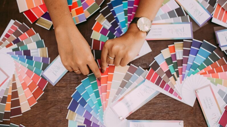
Color psychology is a fascinating field that explores how colors influence human behavior, emotions, and perceptions. As you navigate through your daily life, you may not realize the profound impact that colors have on your mood and decision-making processes. From the vibrant hues of a sunset to the calming shades of a serene landscape, colors evoke feelings and reactions that can shape your experiences.
Understanding color psychology can empower you to make informed choices in various aspects of your life, particularly in interior design, where the right color palette can transform a space and enhance your overall well-being. In the realm of interior design, color is not merely an aesthetic choice; it is a powerful tool that can create an atmosphere conducive to relaxation, productivity, or creativity. By delving into the principles of color psychology, you can learn how to harness the emotional responses elicited by different colors.
This knowledge allows you to curate spaces that resonate with your personal style while also catering to the psychological needs of those who inhabit them. Whether you are redecorating your home or designing a workspace, understanding the nuances of color can lead to more intentional and impactful design decisions.
Key Takeaways
- Color psychology explores the impact of different colors on human emotions and behavior.
- Colors can evoke specific moods and emotions, such as red for energy and passion, or blue for calmness and relaxation.
- The use of color can influence the perception of space, with warm colors making a room feel cozier and cool colors making it appear larger.
- Different rooms in a home may benefit from specific color palettes, such as calming blues for bedrooms and energizing yellows for kitchens.
- By understanding color psychology, designers can create desired atmospheres in interior spaces, such as using green for a sense of harmony and balance.
The Impact of Color on Mood and Emotions
Colors have an undeniable ability to influence your mood and emotions. For instance, warm colors like red, orange, and yellow are often associated with energy, warmth, and excitement. When you enter a room painted in these hues, you may feel invigorated and inspired.
Conversely, cool colors such as blue, green, and purple tend to evoke feelings of calmness and tranquility. Imagine stepping into a space adorned with soft blues and greens; it’s likely that you would feel more relaxed and at ease. This emotional response to color is not just subjective; it is rooted in psychological research that demonstrates how different colors can trigger specific feelings.
Moreover, the impact of color on mood extends beyond individual preferences. Cultural associations also play a significant role in how you perceive colors. For example, in many Western cultures, white symbolizes purity and innocence, while in some Eastern cultures, it is associated with mourning.
Understanding these cultural nuances can help you make more informed choices when selecting colors for your space. By considering both personal and cultural associations with color, you can create an environment that resonates positively with you and those around you.
How Color Influences Perception of Space

The way you perceive space can be dramatically altered by the colors used within it. Lighter colors tend to make a room feel more spacious and open, while darker shades can create a sense of intimacy and coziness. If you have a small room that feels cramped, painting the walls in soft pastels or light neutrals can visually expand the space, making it feel more inviting.
On the other hand, if you want to create a snug reading nook or a cozy bedroom, deeper hues like navy or forest green can envelop the space in warmth. Additionally, the use of color can affect how you navigate through a space. For instance, using contrasting colors for different areas can help delineate spaces within an open floor plan.
You might choose a bold accent wall to define a dining area within a larger living space, guiding your eye and creating a sense of organization. By strategically employing color to influence spatial perception, you can enhance both functionality and aesthetics in your design.
Choosing the Right Color Palette for Different Rooms
When it comes to selecting a color palette for various rooms in your home, it’s essential to consider the purpose of each space and how you want to feel while using it. For example, in bedrooms where relaxation is key, soft blues or muted greens can promote restful sleep and tranquility. In contrast, kitchens often benefit from brighter colors like yellows or whites that evoke energy and cheerfulness, making them ideal for social gatherings and culinary creativity.
Living rooms serve as multifunctional spaces where family and friends gather, so choosing a balanced palette that combines warm and cool tones can create an inviting atmosphere. You might opt for earthy tones like terracotta or olive green paired with soft creams to foster warmth while maintaining a sense of calm. By thoughtfully selecting colors based on the intended use of each room, you can create harmonious environments that cater to your lifestyle.
Using Color to Create a Desired Atmosphere
The atmosphere of a room is heavily influenced by its color scheme. If you aim to cultivate an energetic environment for activities like exercise or brainstorming sessions, vibrant colors such as bright orange or electric blue can stimulate creativity and motivation. Conversely, if your goal is to establish a serene atmosphere for meditation or relaxation, softer shades like lavender or pale pink can help create a peaceful sanctuary.
Lighting also plays a crucial role in how colors are perceived within a space. Natural light can enhance the vibrancy of colors during the day, while artificial lighting may alter their appearance in the evening. Therefore, when designing your space, consider how different lighting conditions will interact with your chosen color palette throughout the day.
By aligning your color choices with the desired atmosphere and lighting conditions, you can create spaces that truly reflect your intentions.
Incorporating Color Psychology into Design Elements

Incorporating color psychology into design elements goes beyond wall paint; it extends to furniture, accessories, and artwork as well. For instance, selecting furniture pieces in colors that align with your desired mood can enhance the overall ambiance of a room. A bright yellow chair might serve as an energizing focal point in an otherwise neutral living room, while a deep blue sofa could anchor a space with its calming presence.
Artwork is another powerful way to infuse color psychology into your design scheme. Choosing pieces that feature colors aligned with your emotional goals can create visual interest while reinforcing the desired atmosphere. A vibrant abstract painting may inspire creativity in a home office, while serene landscape photography could enhance relaxation in a bedroom.
By thoughtfully curating design elements that reflect color psychology principles, you can create cohesive spaces that resonate with your emotional needs.
The Role of Color in Creating a Cohesive Design Scheme
A cohesive design scheme relies heavily on the effective use of color throughout your space. When all elements harmonize visually through a well-thought-out color palette, it creates a sense of unity that enhances the overall aesthetic appeal. To achieve this cohesion, consider using a primary color as the foundation for your design and then incorporating complementary or analogous colors to add depth and interest.
For example, if you choose teal as your primary color for a living room, you might incorporate coral accents through throw pillows or artwork while using neutral tones like beige or gray for larger furniture pieces. This approach not only creates visual harmony but also allows for flexibility in changing decor over time without losing the overall cohesiveness of the design scheme. By being intentional about your color choices across different elements within your space, you can cultivate an environment that feels both curated and inviting.
Harnessing the Power of Color in Interior Design
In conclusion, understanding color psychology offers invaluable insights into how colors affect mood, perception, and overall atmosphere within interior spaces. By recognizing the emotional responses elicited by different hues and their cultural significance, you can make informed decisions when designing your home or workspace. Whether you’re aiming for tranquility in a bedroom or vibrancy in a creative studio, the right color palette can significantly enhance your experience.
As you embark on your design journey, remember that color is not just about aesthetics; it is about creating environments that resonate with your emotions and lifestyle. By thoughtfully incorporating color psychology into your design choices—from wall paint to furniture selection—you have the power to transform any space into one that reflects who you are while fostering well-being and connection. Embrace this knowledge as you curate spaces that inspire joy, creativity, and comfort in your everyday life.
FAQs
What is color psychology in interior design?
Color psychology in interior design is the study of how different colors can affect human emotions, moods, and behaviors in a designed space. It involves understanding the psychological effects of various colors and using this knowledge to create harmonious and balanced interior environments.
How does color psychology impact interior design?
Color psychology impacts interior design by influencing the atmosphere and ambiance of a space. Different colors can evoke different emotions and have the power to create a sense of calm, energy, warmth, or tranquility within a room. Interior designers use color psychology to create spaces that cater to the specific needs and preferences of their clients.
What are some common associations with specific colors in interior design?
– Blue: Often associated with calmness, serenity, and relaxation. It can create a sense of tranquility in a space.
– Red: Known for evoking energy, passion, and excitement. It can add warmth and vibrancy to a room.
– Yellow: Symbolizes happiness, positivity, and optimism. It can bring a sense of cheerfulness to a space.
– Green: Represents nature, growth, and harmony. It can create a feeling of balance and renewal in a room.
– Purple: Often associated with luxury, creativity, and spirituality. It can add a sense of sophistication to a space.
– White: Symbolizes purity, cleanliness, and simplicity. It can create a sense of spaciousness and cleanliness in a room.
How can interior designers use color psychology in their work?
Interior designers can use color psychology to create cohesive color schemes that align with the desired mood and function of a space. They can also use color to highlight architectural features, create focal points, and guide the flow of movement within a room. Additionally, designers can use color psychology to personalize spaces based on the specific needs and preferences of their clients.


